Brite Psychology
Brite Psychology needed a brand that struck the right balance between feeling bright and calm. It had to feel professional and polished, but still warm, calm and approachable. The brief was clear: bright without being loud, clinical without being cold. Challenge accepted.
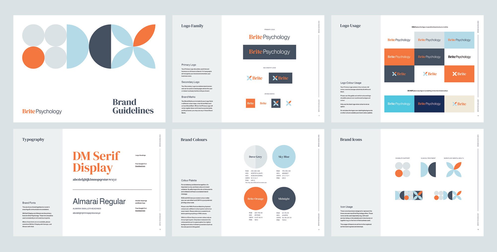
The identity is built around abstract shapes and a softly optimistic palette, designed to feel open, grounded and kind. The shapes represent the many moving parts of a person and the non-linear nature of each individual journey. Nothing is fixed, yet everything is connected. This flexible visual language carries through the logo, collateral and website to create a brand that feels consistent, thoughtful and reassuring.
The result is a brand that reflects the heart of the practice. Clear, compassionate and genuinely welcoming.
OVERVIEW
PROJECT SCOPE
Brand Strategy
Brand Identity Design
Marketing Collateral
Signage
Website