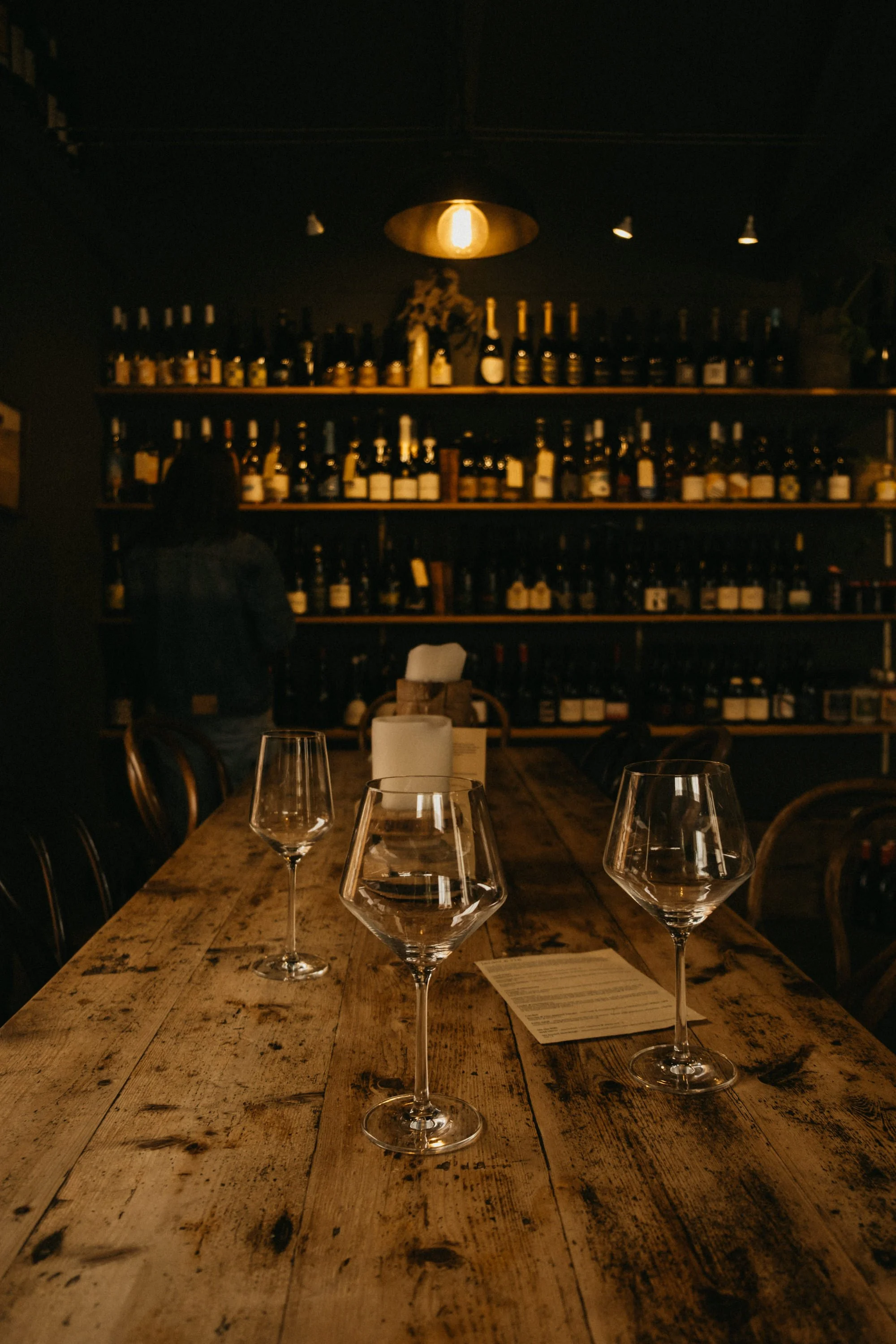
Larder & Vin is part wine bar, part pantry. It’s a place to settle in with a glass of something interesting, share a plate of perfectly imperfect things, and leave with a jar of chutney or a vintage tablecloth you didn’t know you needed.
The brand was built to reflect that mood: tactile, generous and full of soul. The logo feels old-world but easy, paired with earthy textures and quiet colour. The website mirrors the space itself — moody, layered and intentionally unpolished. Every touchpoint invites people to slow down, learn something, taste something and take a little of the magic home.
OVERVIEW
Old world charm housing the regions best drops and tasty morsels.
larderandvin.com.au →
Larder & Vin
PROJECT SCOPE
Brand Identity
Signage
Website


