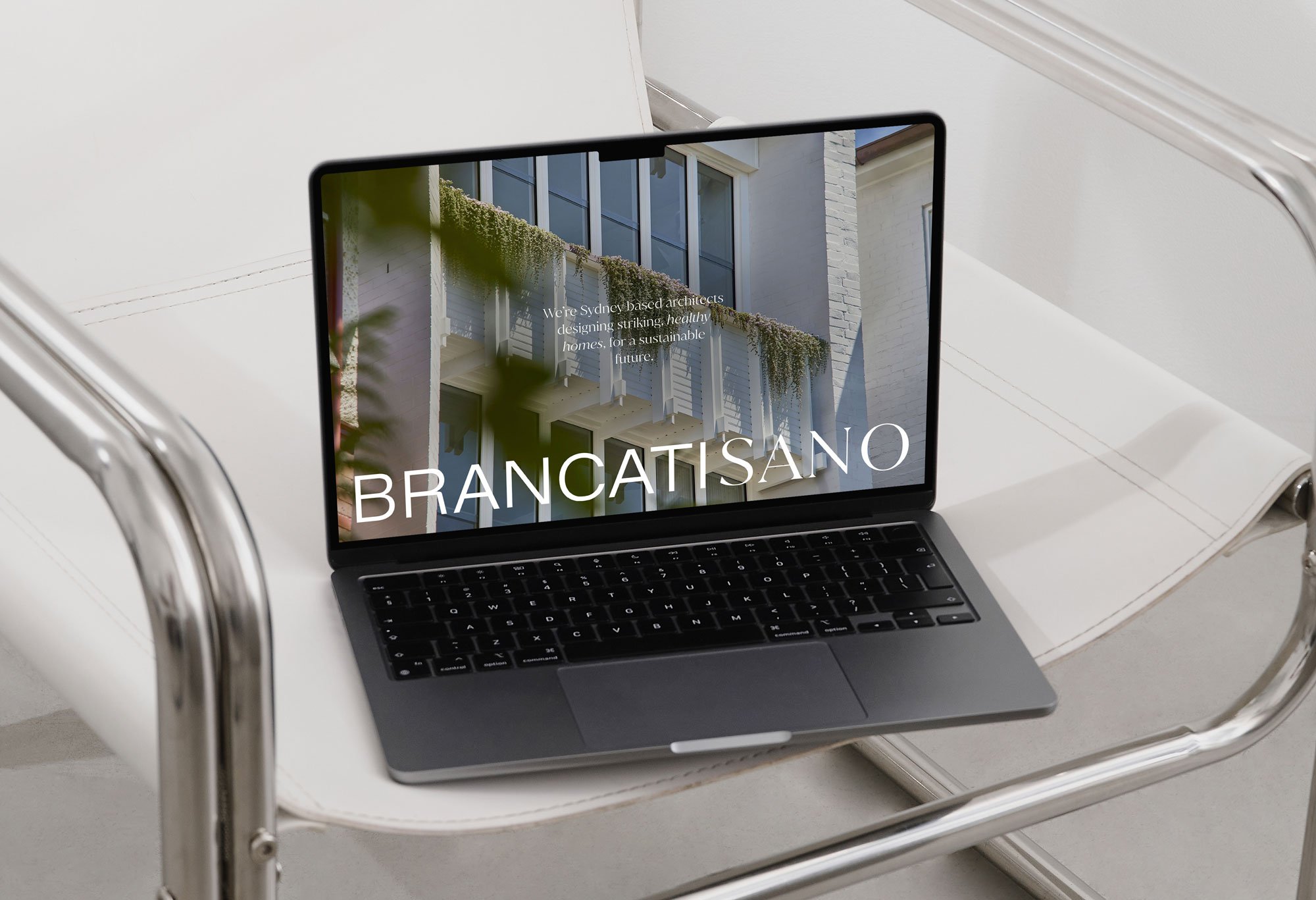
Sydney Architect designing homes for a sustainable future.
brancatisano.com →
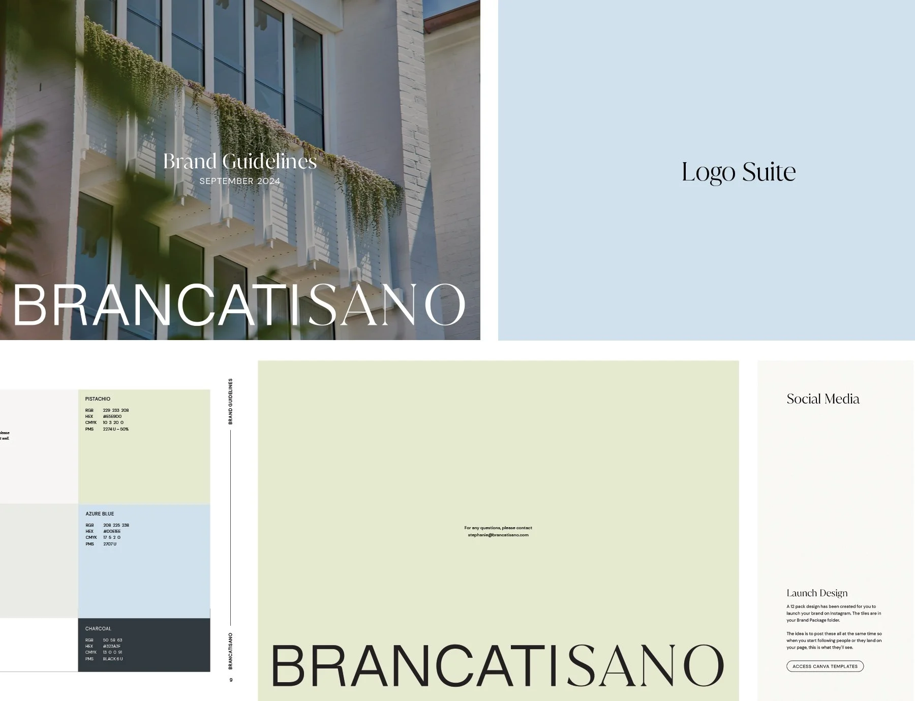
Brancatisano
Brancatisano isn’t a typical architecture studio — and that’s entirely intentional. Rooted in sustainability, empathy and thoughtful design, the brand needed to reflect a slower, more considered way of working.
Clarity was essential. With a long, often-misread surname at its centre, the identity was designed to feel refined, legible and quietly confident. We highlighted Sano in a contrasting typeface to bring ease to the name — and to reinforce its deeper meaning. In Italian, sano translates to healthy, a subtle nod to the studio’s holistic approach to architecture, from concept to completion.
A soft, natural palette is paired with curated pastel accents to bring warmth and personality. A signature lilac tone offers a gentle nod to Brisbane’s jacaranda season — a quiet detail grounded in place and rhythm.
The result is a brand that mirrors the spaces she creates: calm, intelligent and deeply considered.
OVERVIEW
PROJECT SCOPE
Brand Identity Design
Marketing Collateral
Website